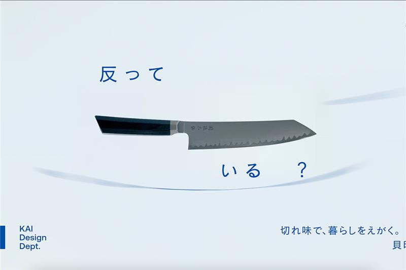
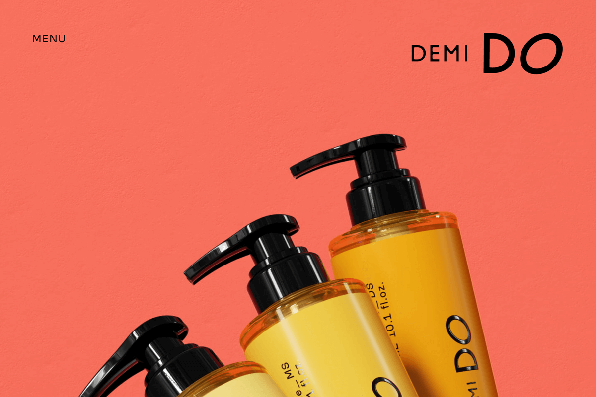
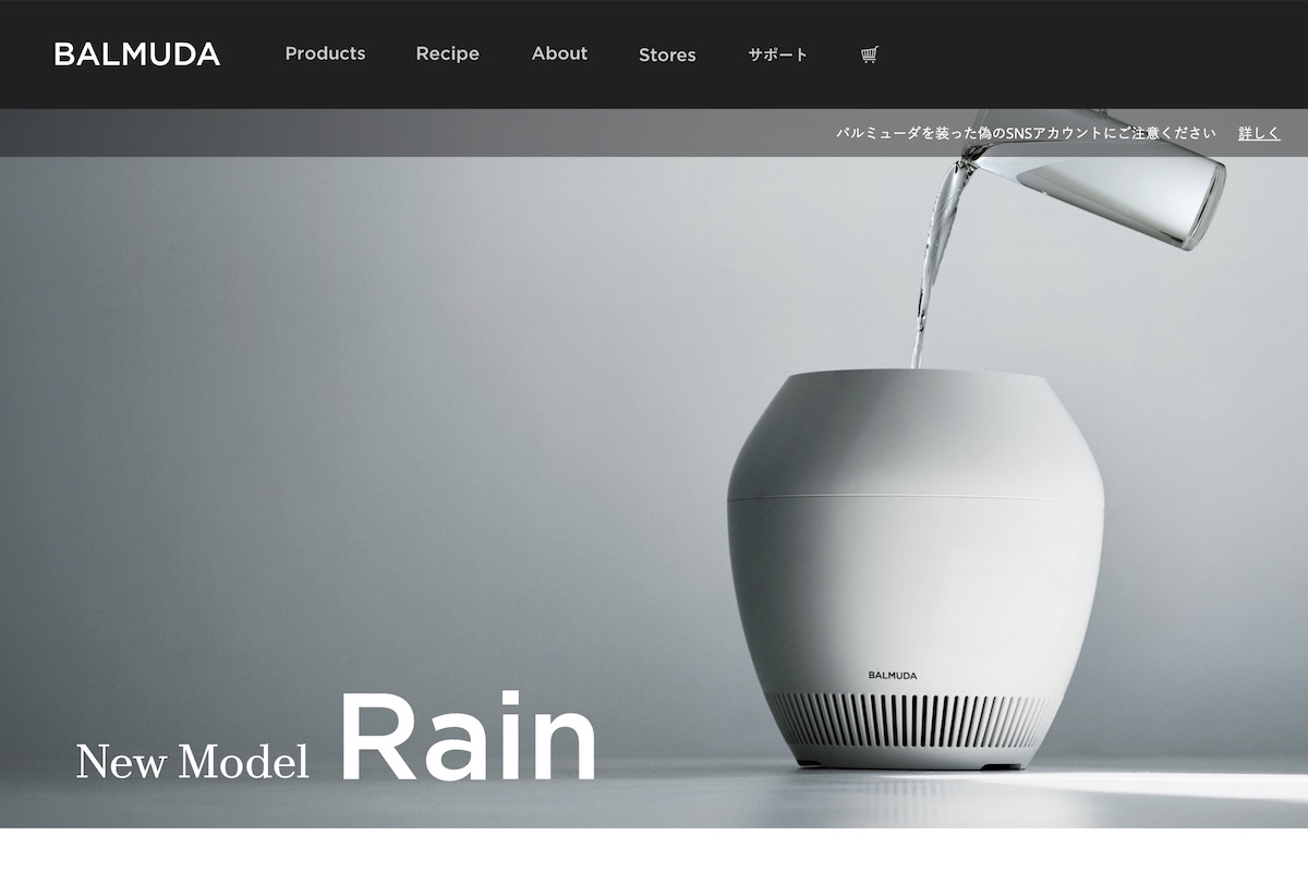
The Nikon Design Website is a masterclass in corporate elegance and minimalist UX. With its sticky nav, breadcrumb trails, and international accessibility, the structure feels invisible in the best way — you navigate without thinking. Visually, it’s clean, grid-driven, and soaked in Japanese minimalism, punctuated only by Nikon’s signature yellow. The “Design Stories” humanize the brand with smart storytelling and immaculate imagery. It’s nearly flawless, except for a few accessibility stumbles (hover-only interactions, low-contrast text) and mobile tap zones that need a bit more breathing room. Still, this is one of the rare corporate websites that feels like it was built by people who genuinely care about design — not just about showing it off.