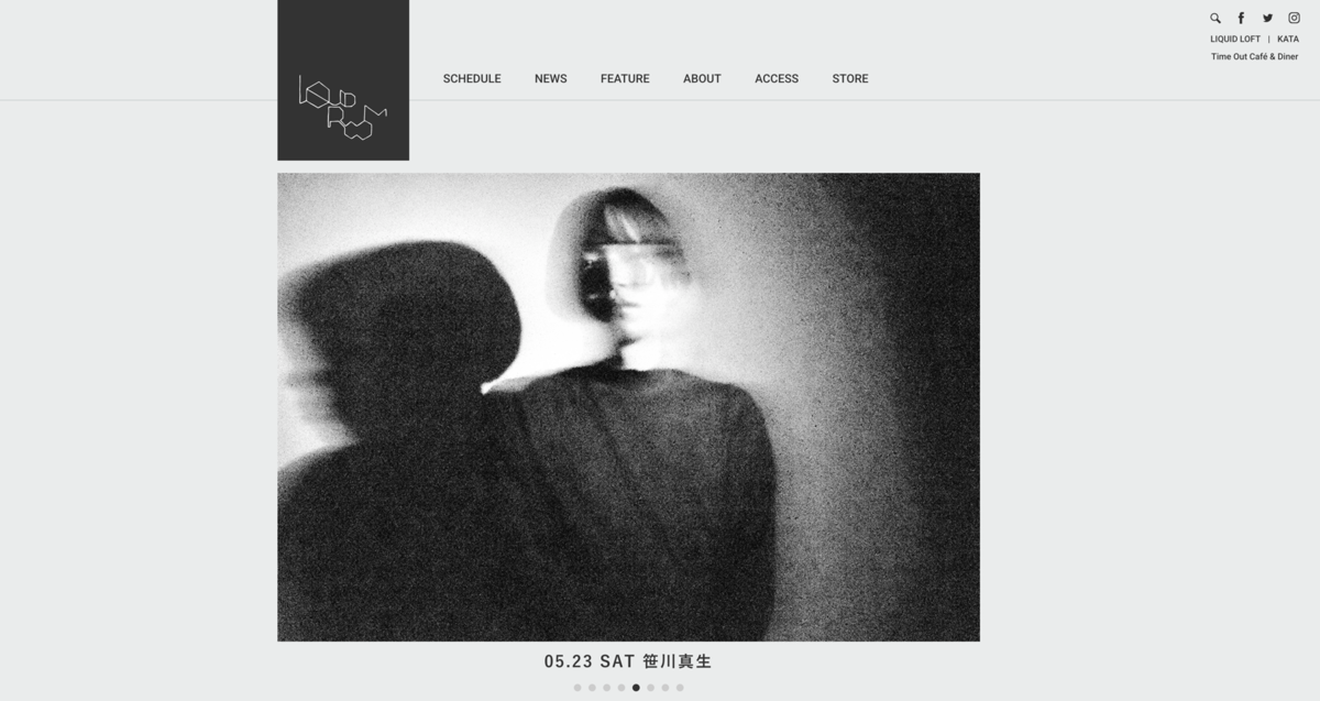
Shift Tokyo’s website doesn’t just flex design muscles—it performs a precision-engineered ballet in white space. It’s a minimalist masterpiece with interactive soul, where every scroll delivers a flicker of refined chaos through 2D animations that never overstay their welcome. This isn’t flash-for-flash’s-sake; it’s kinetic poetry with a clear conscience.
The vibe? Crisp as a starched shirt, serene as a Kyoto garden. The white background hums with restraint, the muted color palette whispers taste, and the typography? Sharp, stylish, no-nonsense—like Helvetica just came back from a spa weekend.
Navigation glides smoother than a Shinkansen—no clunky menus or visual potholes. The ever-morphing logo adds just the right amount of digital quirk, giving the site a pulse. And the speed? Instantaneous. Blink and you’re in—this thing doesn’t load, it appears.
What seals the deal is the vision: the site breathes future-forward creativity without a hint of arrogance. It’s not just a web presence—it’s a digital manifesto, serving both aesthetic clarity and technical excellence on a silver platter. Japan’s design game? Still several moves ahead.


