Nendo
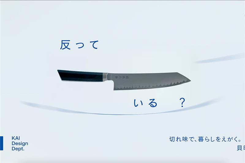
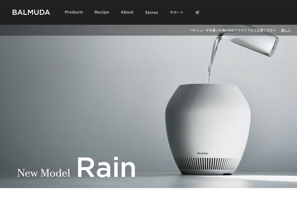
This time, we’re looking at how a Japanese design powerhouse handles its English-language site. Nendo’s website is a masterclass in restraint—sleek, minimalist, and quietly confident. The portfolio-style layout mirrors the brand’s precision, with crisp typography and smooth, almost meditative scrolling. Interactive case studies pull you in without shouting. It’s a rare site where design and function aren’t just aligned—they’re speaking the same calm, curated language. Minimalism here isn’t a trend; it’s a philosophy.


