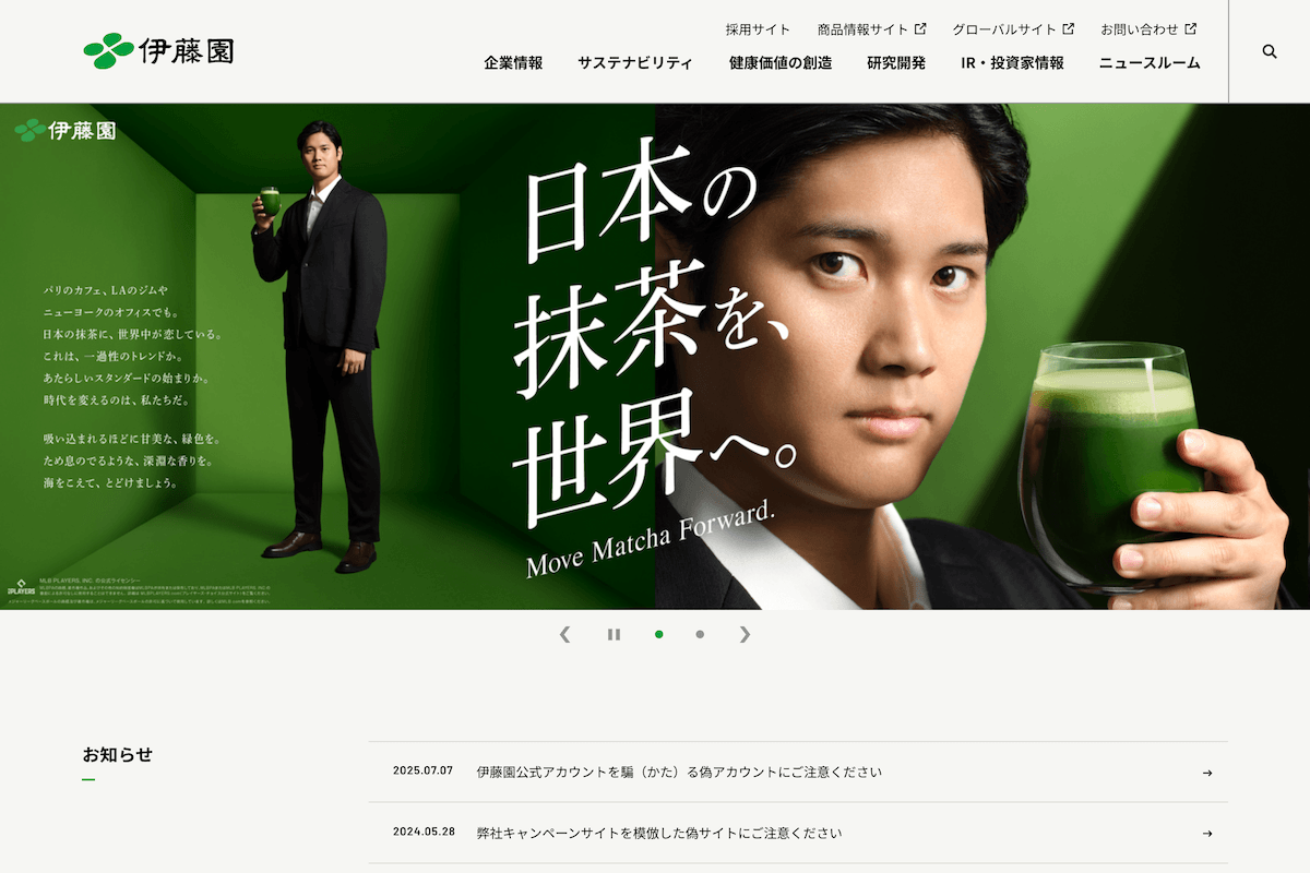
Hitachi’s website is a showcase of scale and competence. It’s structured, information-rich, and clearly built to communicate authority in infrastructure, technology, and sustainability. Everything works. Everything makes sense. And yet—it’s hard to feel engaged.
The design is clean but conservative, prioritizing clarity over personality. Messaging leans heavily on innovation and social impact, but it’s delivered in a tone that feels standardized, almost automated. You understand what Hitachi does, but not necessarily why it matters on a human level.
Navigation is efficient, if slightly rigid. You move through clearly defined pathways, but there’s little sense of discovery or delight. It’s a site that respects your time, but not your curiosity.
In short, it reflects the brand: reliable, serious, and deeply competent. Just not particularly memorable.