Iyoshi Cola

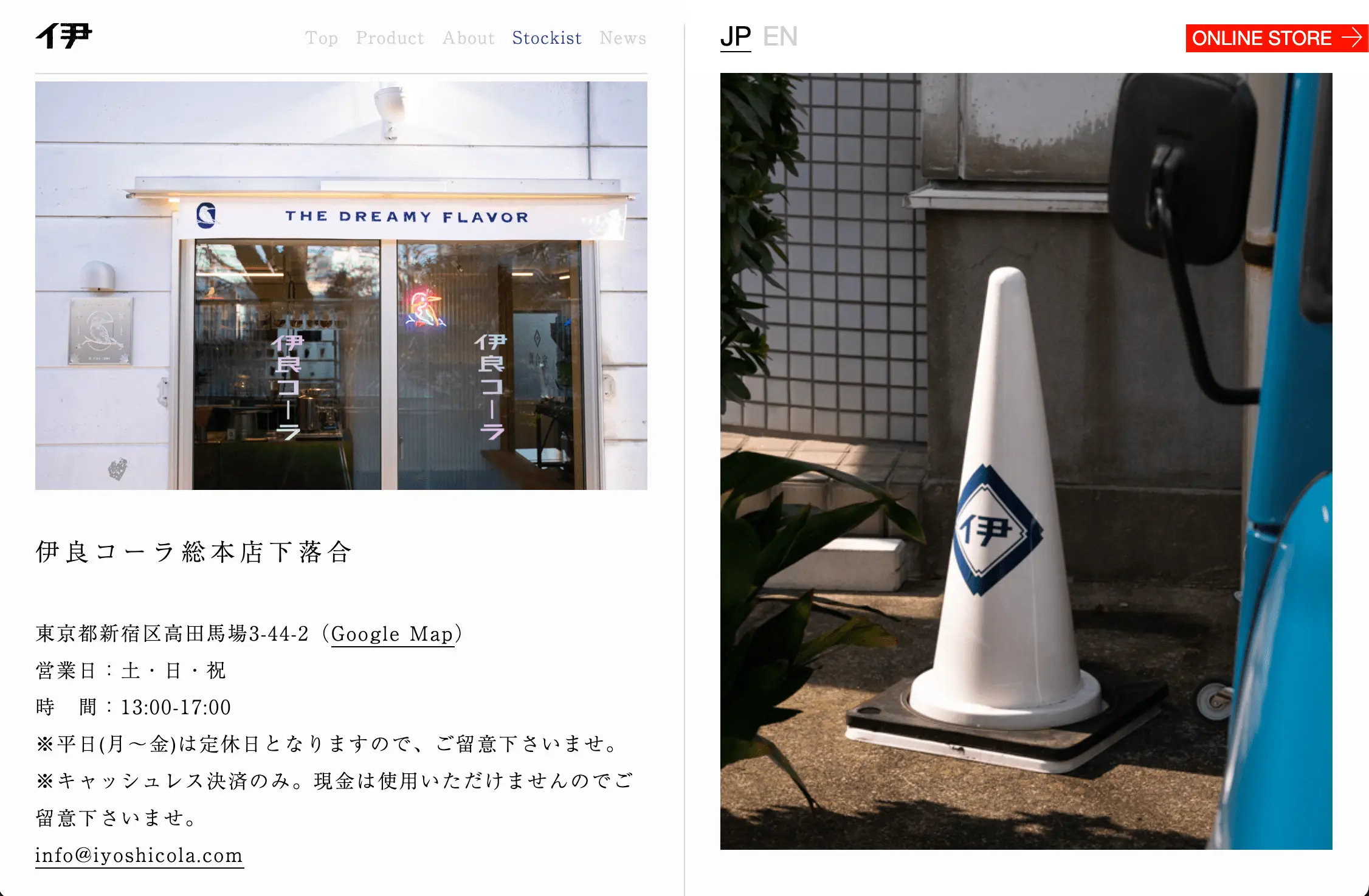
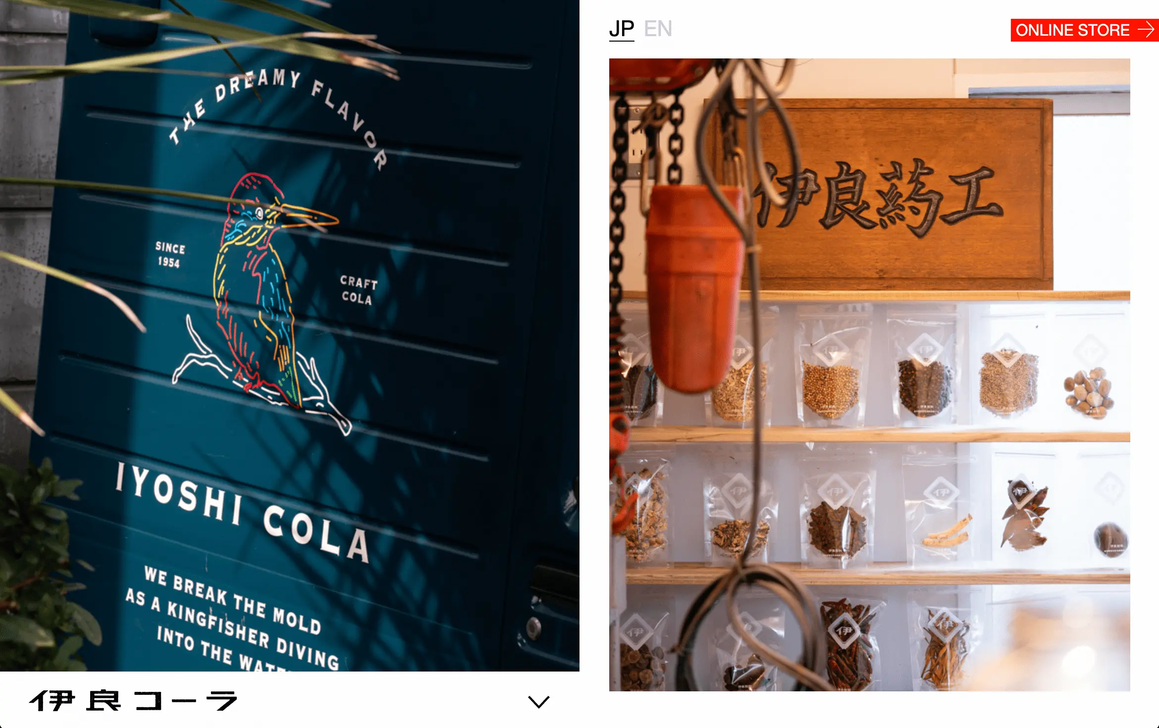
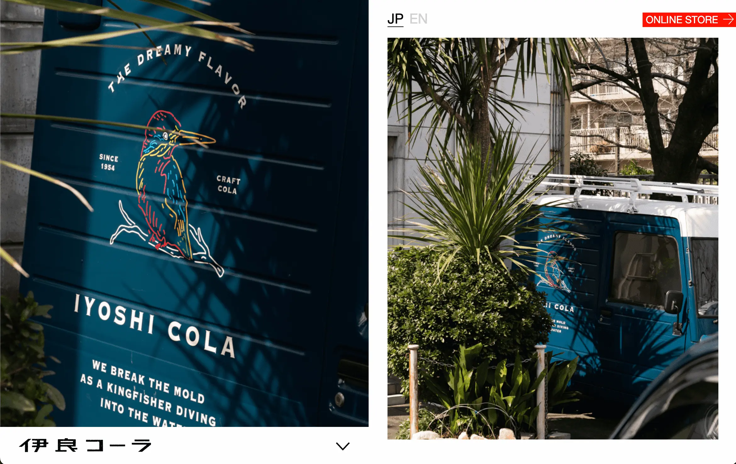
The website features a clean, minimalist design that highlights a modern and premium artisanal brand aesthetic. A bold red “Shop” button effectively guides users to take action. On desktop, a two-column layout combines scrolling text with dynamic images, enhancing engagement for text-heavy sections like “About.” On mobile, the layout adapts to a sequential format, pairing text with corresponding images for a seamless user experience.
about how to submit a site

The clean and minimalist design conveys a modern aesthetic, enhancing the perception of a premium and artisanal brand. The striking red “Shop” button is a smart design choice, effectively guiding users toward the desired action.

In the desktop version, the layout is divided into two columns, with the right column prominently featuring full-sized images. Interestingly, for the “About” section, which includes extensive text, the left column displays the content while the right column dynamically updates images as users scroll. This approach works particularly well for text-heavy pages, maintaining visual interest and improving the reading experience. However, on the mobile version, the text is paired with its corresponding image in a standard sequential layout.
Like it
Share

Submit a site.

Have a site you’d like us to include in the gallery?
Share the URL here along with your reason(s) for submitting it and we’ll have a look!

Name(Required)

Contact Us

Name(Required)
This field is for validation purposes and should be left unchanged.

Iyoshi Cola

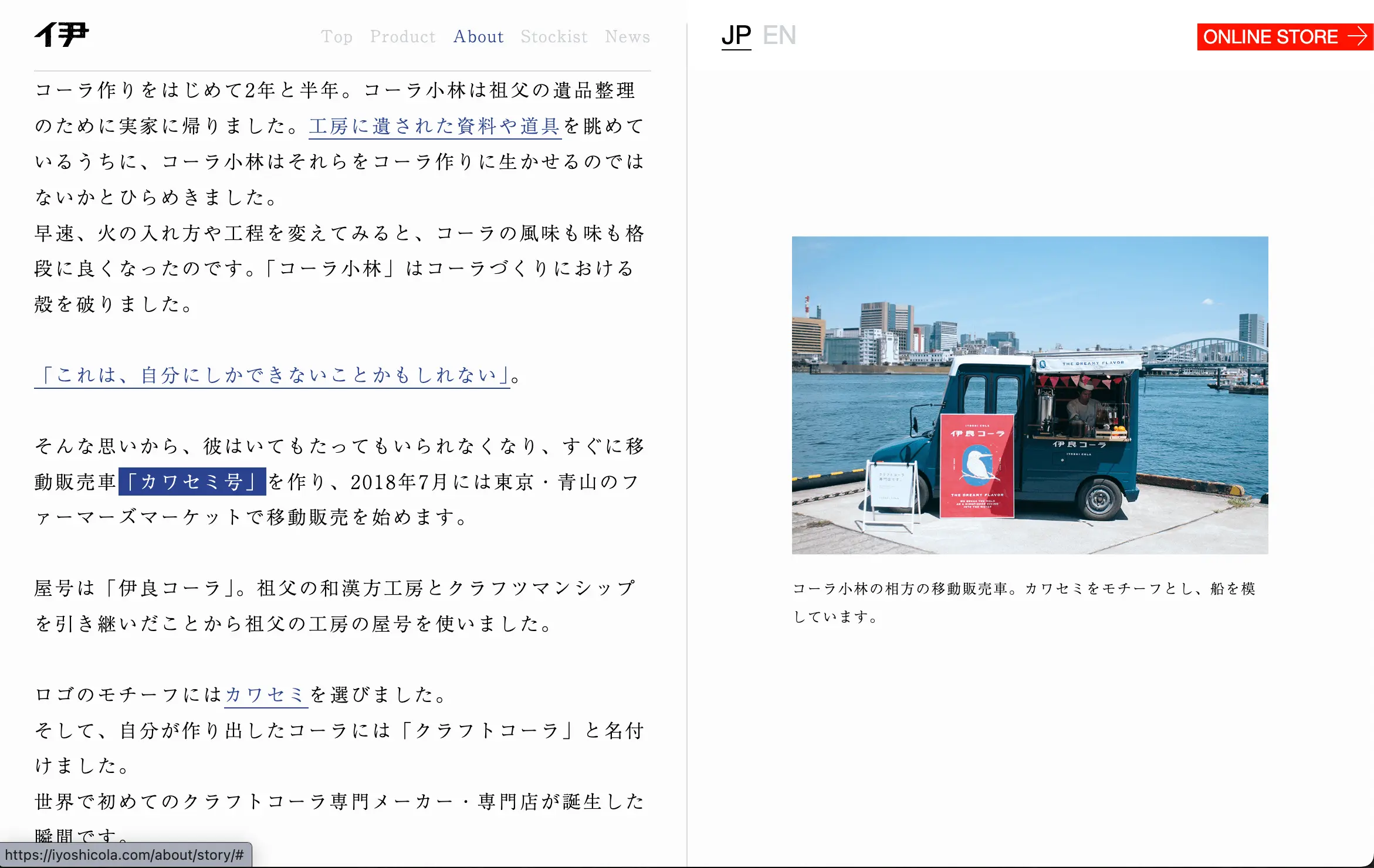
The website features a clean, minimalist design that highlights a modern and premium artisanal brand aesthetic. A bold red “Shop” button effectively guides users to take action. On desktop, a two-column layout combines scrolling text with dynamic images, enhancing engagement for text-heavy sections like “About.” On mobile, the layout adapts to a sequential format, pairing text with corresponding images for a seamless user experience.
The clean and minimalist design conveys a modern aesthetic, enhancing the perception of a premium and artisanal brand. The striking red “Shop” button is a smart design choice, effectively guiding users toward the desired action. In the desktop version, the layout is divided into two columns, with the right column prominently featuring full-sized images. Interestingly, for the “About” section, which includes extensive text, the left column displays the content while the right column dynamically updates images as users scroll. This approach works particularly well for text-heavy pages, maintaining visual interest and improving the reading experience. However, on the mobile version, the text is paired with its corresponding image in a standard sequential layout.
Like it
Share

Have a Japanese website to share?

Send it to us along with your reasons for choosing it using the form below.