
You’re ready to launch in Japan with an awesome new Japanese website. How can you maximize your chances of success?
Stepping into the Japanese market isn’t just another item on your global checklist. Japan’s digital audience has unique expectations: compact, information-rich layouts, rigorous attention to trust signals, and subtle visual cues that align with cultural preferences. If you’ve ever fallen into the trap of thinking ‘just translate our English site and call it done,’ you’re far from alone, but you may be setting yourself up for disappointment.
We see it all the time. Globally recognized brands launch with what looks like a local site, but underneath, it’s still English-first in structure, tone, and UX. The result? Confusion, low engagement, and missed conversions.
The purpose of this article is to help global IT and marketing decision-makers understand the right strategy for Japanese web development. Partnering with a local expert isn’t just a luxury, it’s essential. We’ll show you what not to do, highlight winning examples, explore brands that missed the mark, and wrap up with a guide to choosing the right Japanese agency.
If you’re serious about Japan, read on! Your brand’s reputation and performance will thank you.
Why Japan is Different
Many brands incorrectly treat Japan like any other international market. But that assumption overlooks key cultural and UX/UI distinctions:
Visual density and layout
Japanese users expect pages filled with information: sidebars, banners, and sub-navigation. While Western sites lean toward minimalism, Japanese sites use structure and content density to build clarity and credibility.
Trust through detail
Japanese consumers are risk-averse. They look for FAQ sections, product badges, certifications (like JIS or SSL), local testimonials, influencer endorsements, and 24/7 support options, all featured prominently.
Mobile-first behavior
Japan is a mobile nation. Tap sizes, vertical rhythm, and scrollability matter. Users scan vertically, so clearly structured content blocks and key information at the top are essential.
Landing-page approach
Instead of multi-page navigation, Japanese sites often guide users through long-form landing pages that repeat trust signals and include calls to action throughout.
Visual style differences
What feels clean and modern in the West can look under-designed in Japan. Japanese users favor friendly visuals, seasonal cues, and dense layouts that suggest care and completeness.
Too often, brands simply translate text and leave the structure and visual logic untouched. This is exactly where things go wrong.
The Don’ts: Common Global Mistakes
Here are the top five pitfalls brands frequently make:
DON’T #1: Treat translation as localization
A direct English-to-Japanese translation often results in awkward phrasing, unnatural content, and no emotional resonance. It may meet basic compliance, but it won’t engage or convert.
DON’T #2: Retain Western-centric UX/UI
Minimal menus and bare homepages may look chic elsewhere but feel unfinished in Japan. Local users expect layered content and rich interfaces with many clickable elements.
DON’T #3: Ignore mobile-specific norms
Japanese users scroll quickly. If your site lacks bullet points, has small tap targets, or doesn’t provide easy bottom navigation, you’ll lose users fast. Mobile layouts must be compact and skimmable.
DON’T #4: Skip trust-building elements
In Japan, users look for proof early. Local awards, customer reviews, clear shipping details, and real team photos all contribute to credibility. Skipping these may hurt your conversion rate.
DON’T #5: Apply Western SEO tactics
Japan’s search behavior is different. Users write full-sentence queries, rely more on Yahoo! Japan and other search engines, and expect SEO tailored to local terms like “最安値” (lowest price) or “○○ 比較” (product comparison). You need a local search strategy.
The Dos: What Succeeds
Here’s what you should do:
DO #1: Localize structure, not just language
Rebuild the site to match Japanese browsing habits. Use block-style landing pages, collapsible content sections, Q&A formats, and visuals optimized for mobile clarity.
DO #2: Follow Japanese reading patterns
Place key information first, break text into bullet points, and add CTAs mid-scroll, not just at the end. Short paragraphs and clear structure improve engagement.
DO #3: Visually and contextually build trust
Showcase localized badges, user reviews, case studies, and guarantees. Embrace seasonal visuals and copy that align with Japanese values.
DO #4: Iterate with local feedback
Test with Japanese users, interview them, and refine layouts based on their behavior. Even polished global designs may reveal flaws without local insight.
DO #5: Partner with local experts
A bilingual team that understands Japanese behavior, visual patterns, and technical standards ensures your site truly speaks to the local audience.
Brands That Nailed It
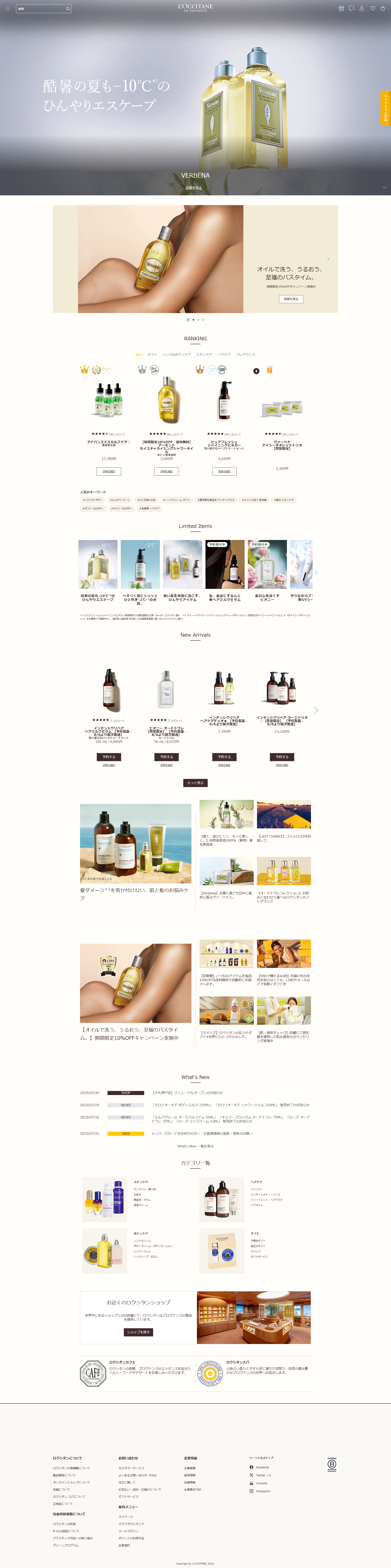
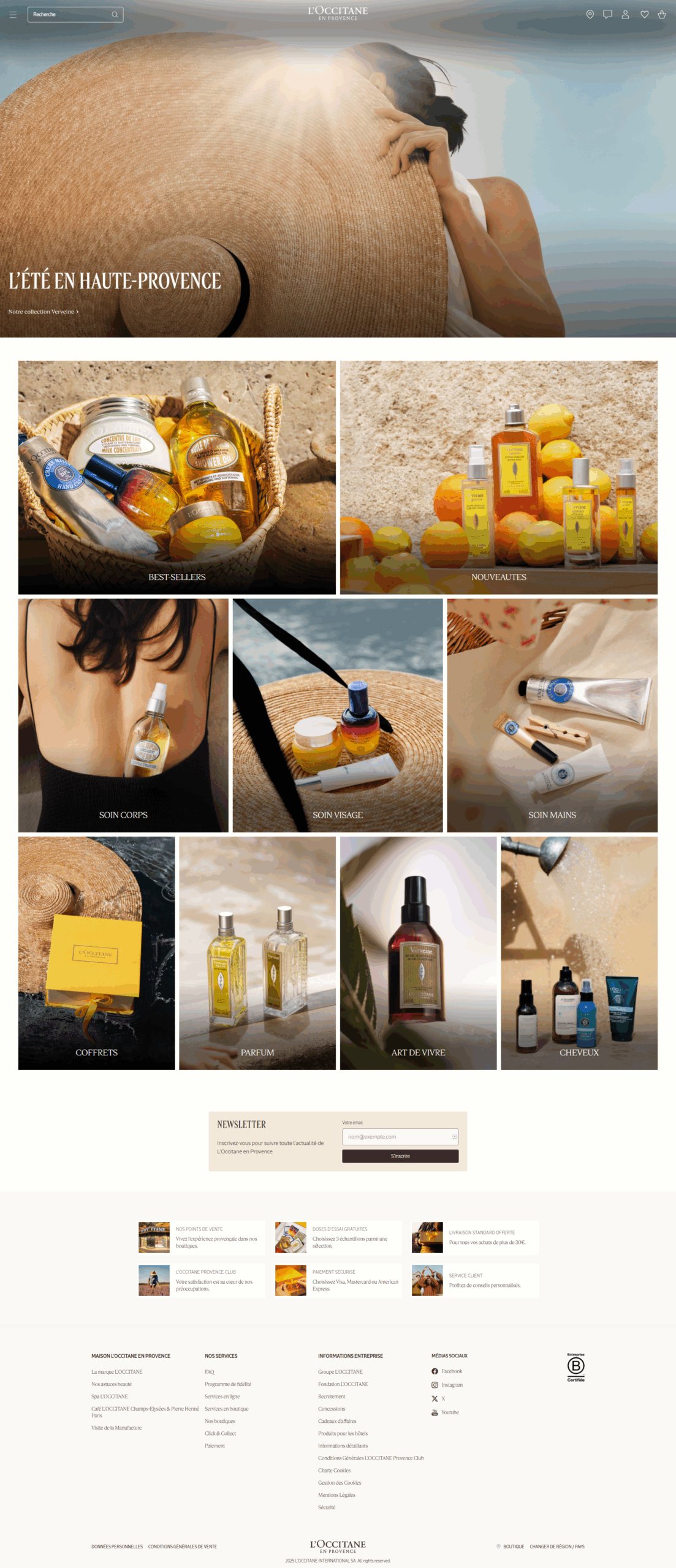
L’Occitane Japan
jp.loccitane.com
- Layout: A seasonal, landing-page design with structured product blocks and mobile-first campaign visuals.
- UX shift: Navigation is rewritten for Japan, featuring sections like “お知らせ,” “スキンケア,” and “フレグランス.”
- Result: The Japan site presents a more information-rich, mobile-optimized experience compared to its French counterpart, contributing to stronger engagement with local users and seasonal promotions.
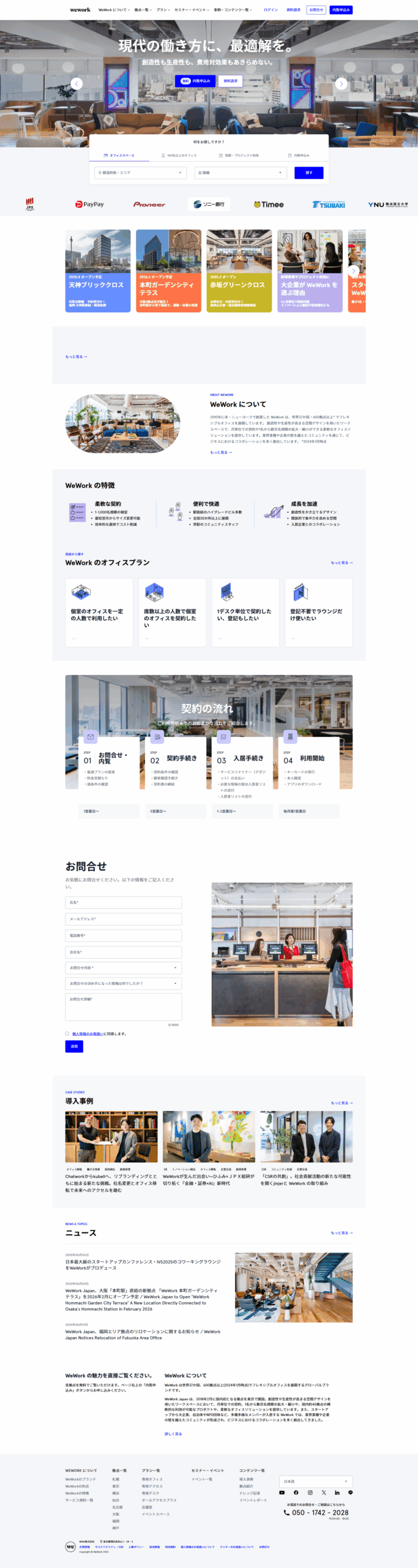
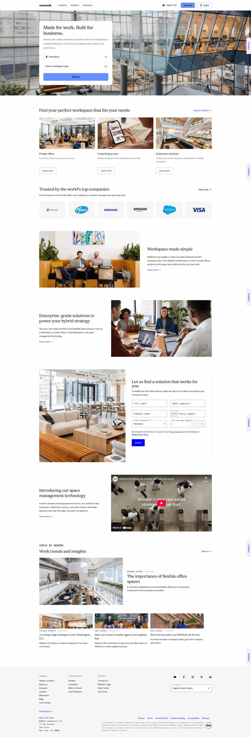
WeWork Japan
wework.co.jp
A mobile-first experience with clear CTAs, simplified user flows, and bilingual content that balances keigo and casual tone. CTAs such as “見学を申し込む” and “営業時間を見る” are repeated throughout the scroll to maintain engagement.
IKEA Japan
ikea.com/jp
- Structure: The site features a catalog-style layout with seasonal sections like “新生活” and “SOFA特集” for localized storytelling.
- Content: Product pages include サイズ調整, assembly videos, and store pickup information.
- Result: IKEA’s FY24 report shows online visits grew from 3.8 billion to 4.6 billion globally (IKEA newsroom, inter.ikea.com).
Brands That Missed the Mark
Vilbrequin Japan
vilebrequin.com/eu/en/japan
- What’s wrong: The Japanese homepage is just a locale selector overlay. Product pages redirect to the European site with Japanese pricing, but nothing else is adapted.
- Missing elements: No local campaigns, no Japanese lifestyle visuals, and no trust builders such as size guides or return policies.
- Why it fails: In Japan’s luxury swimwear market, cultural and lifestyle context is vital. A copy-paste site undermines trust.
Marvis Japan
marvis.jp
- What’s wrong: The site strips global storytelling and feels like a basic e-commerce store. The editorial tone is lost. Instead of inviting users into a playful, lifestyle-driven experience, the site presents products and purchase buttons with little context. A compromise would have been to do something similar to the Hong Kong website. Not as interactive as the global one, but it is a showcase website first and an e-commerce second. That approach maintains the brand’s personality while still driving sales.
- Missed opportunity: Marvis’s Hong Kong site retains playful lifestyle content. The Japanese site, however, feels flattened and transactional.
So… Should You Go It Alone?
Let’s be honest, trying to build your Japanese site without local insight is risky, even for global teams.
Yes, you could translate your site, add yen pricing, and go live. But even top-tier brands stumble. It’s not just about conversions, it’s about perception.
A local partner will help reshape your visuals and structure, clarify your message, and align with Japanese standards of quality and detail. That’s the difference between a site that works and one people trust.
What to Look for in a Local Partner
If you’re ready to bring in local expertise, here’s what to vet:
- Japan-first projects
Ask for examples built specifically for Japan, not global templates. Look for local navigation, seasonal strategies, and mobile-first success. - Bilingual strategy and UX
Ensure they create and craft content in Japanese, not just translate your copy. Localized strategy should lead design decisions. - Familiarity with local digital behavior
The right partner understands SEO (Yahoo! Japan, Google etc.), Japanese scrolling habits, and trusted design patterns. - Strong content-design-tech alignment
They advise on copy, visuals, performance, compliance, payment integrations, forms, and more. Request measurable case studies.
If they can’t show results, reconsider.
Final Thoughts
Japan is a high-potential market, but only if approached with cultural fluency and respect. A Japanese website isn’t just a language swap, it’s a complete redesign of content, UX, and design to meet local expectations.
Brands that succeed take the time and effort to localize. They adapt structure, messaging, and visuals to speak naturally and build trust.
If you’re ready to do the same, the team at Tokyo-based web agency Netwise specializes in Japan-first website strategy, UX, and design. We’ll audit your site, recommend improvements, and build a roadmap for success.