Yodobashi Camera
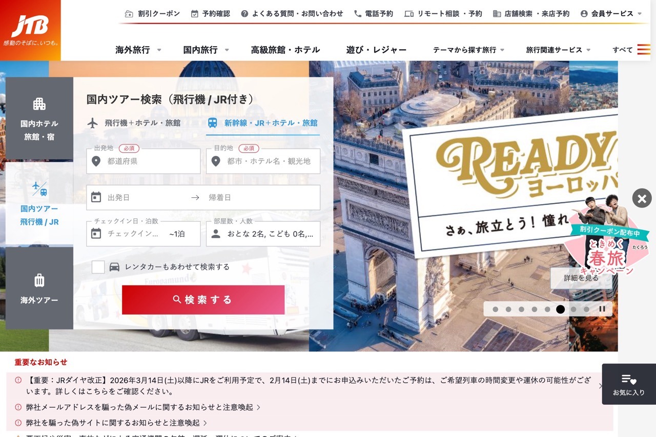
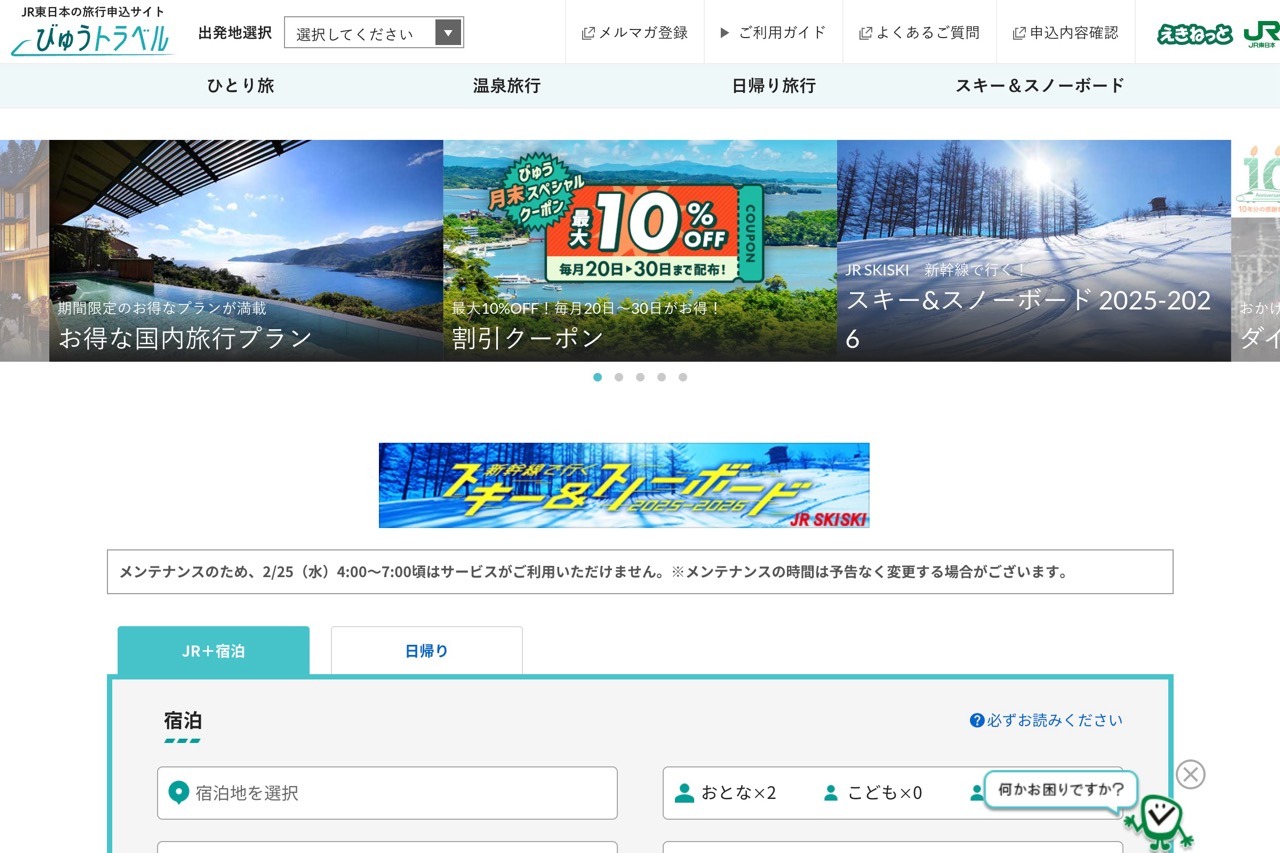
Yodobashi Camera’s website feels like a digital pachinko parlor—overwhelming, cluttered, and loud. Packed with competing banners, dense menus, and minuscule images, it turns online shopping into a quest for the brave. The navigation is a maze of layers within layers, challenging even the savviest users. This style, rooted in old-school Japanese web design, proves that more isn’t always better when it comes to modern user experience.


