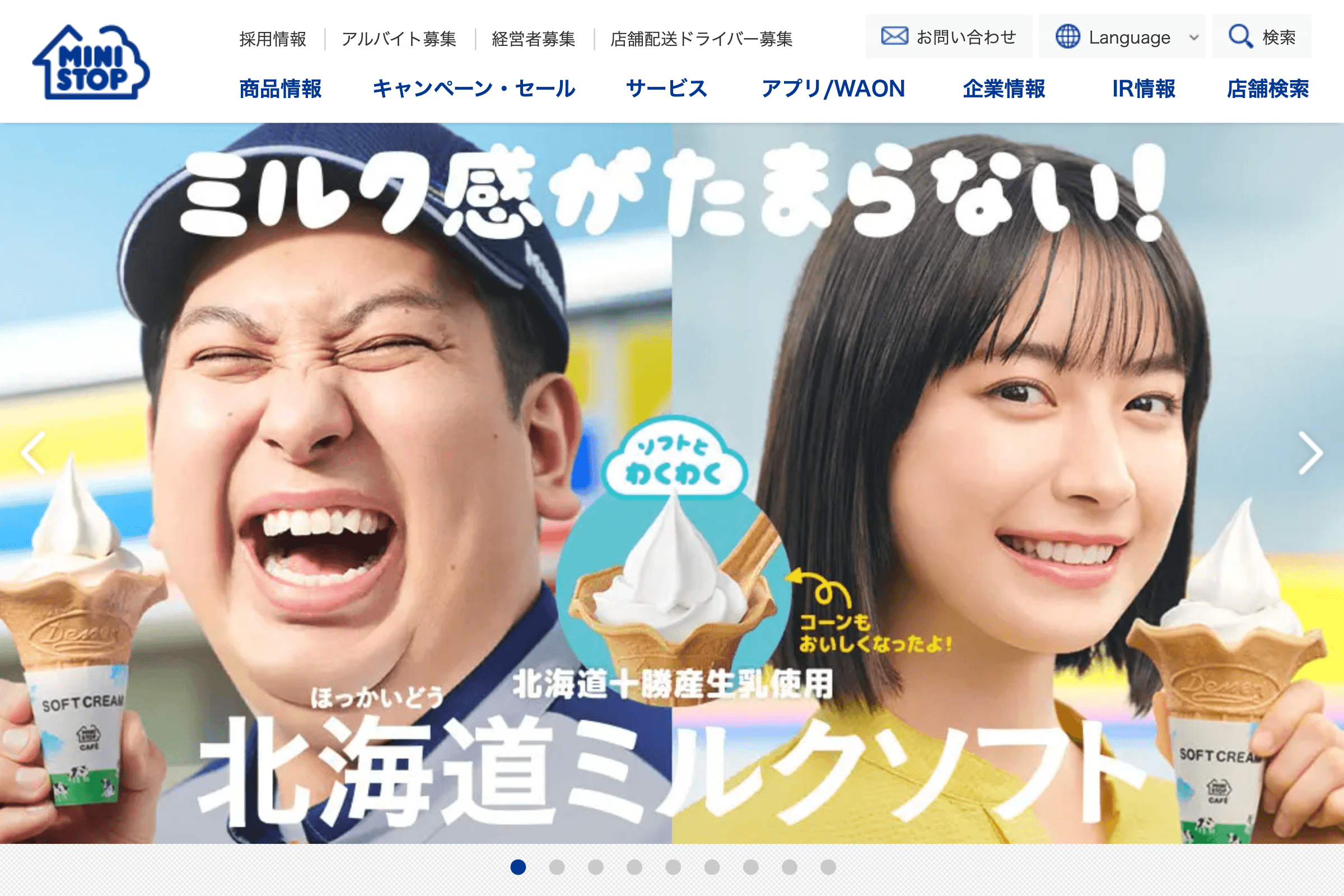
Toono Women’s Clinic

Toono Women’s Clinic nails the soft-sell aesthetic: pastel serenity, spa-vibes, and just enough whitespace to soothe a panic attack. Navigation is idiot-proof (in a good way), and the icons do the heavy lifting so you don’t have to read a novel just to find the OB/GYN section. It’s clean, it’s kind, and it whispers “we care” without the usual corporate coldness. A rare case where form meets function and actually gives a damn.
about how to submit a site

Toono Women’s Clinic’s website is what happens when a UX designer actually listens to a human being. Soft pastels, white space you could park a car in, and not a stressy pixel in sight—it’s less “doctor’s office,” more “exhale slowly.” The design doesn’t just whisper calm; it hums it like a lullaby with a web-safe font.

Navigation? Foolproof. Even your technophobic aunt with a cracked iPad could find what she needs without calling a grandkid. Everything’s labeled clearly, menus behave themselves, and accessibility isn’t an afterthought—it’s baked in like it should be. Someone actually cared about universal design here, and it shows.

Imagery avoids the sterile nightmare of stock clinic shots. No shiny tools or awkward doctor-patient hand-holding poses. Just warm, human visuals and a layout that breathes. Text isn’t crushed into corners or smothered by design excess. Instead, whitespace gets room to do its thing—making the whole site feel as light and digestible as a chamomile tea ad.

Typography is clean without trying to win any Helvetica awards. It’s readable, sensible, and gracefully guides your eye like a gentle hall monitor. Headings get your attention without shouting, and the body text won’t leave you squinting or rage-scrolling.

It also earns points for being mobile-friendly without looking like a desktop site squeezed through a juice press. The layout adjusts elegantly across devices—no tragic stacking or squished buttons here. Whether you’re on a phone or a laptop, the experience holds up.

Bottom line: this site is what healthcare web design should be—empathetic, accessible, and unfussy. It doesn’t just inform, it reassures. You leave the homepage a little calmer than when you arrived, and in the world of online medical content, that’s practically a miracle.

1
Like it
1
Share

Submit a site.

Have a site you’d like us to include in the gallery?
Share the URL here along with your reason(s) for submitting it and we’ll have a look!

Name(Required)

Contact Us

This field is for validation purposes and should be left unchanged.
Name(Required)

Toono Women’s Clinic

Toono Women’s Clinic nails the soft-sell aesthetic: pastel serenity, spa-vibes, and just enough whitespace to soothe a panic attack. Navigation is idiot-proof (in a good way), and the icons do the heavy lifting so you don’t have to read a novel just to find the OB/GYN section. It’s clean, it’s kind, and it whispers “we care” without the usual corporate coldness. A rare case where form meets function and actually gives a damn.
Toono Women’s Clinic’s website is what happens when a UX designer actually listens to a human being. Soft pastels, white space you could park a car in, and not a stressy pixel in sight—it’s less “doctor’s office,” more “exhale slowly.” The design doesn’t just whisper calm; it hums it like a lullaby with a web-safe font. Navigation? Foolproof. Even your technophobic aunt with a cracked iPad could find what she needs without calling a grandkid. Everything’s labeled clearly, menus behave themselves, and accessibility isn’t an afterthought—it’s baked in like it should be. Someone actually cared about universal design here, and it shows. Imagery avoids the sterile nightmare of stock clinic shots. No shiny tools or awkward doctor-patient hand-holding poses. Just warm, human visuals and a layout that breathes. Text isn’t crushed into corners or smothered by design excess. Instead, whitespace gets room to do its thing—making the whole site feel as light and digestible as a chamomile tea ad. Typography is clean without trying to win any Helvetica awards. It’s readable, sensible, and gracefully guides your eye like a gentle hall monitor. Headings get your attention without shouting, and the body text won’t leave you squinting or rage-scrolling. It also earns points for being mobile-friendly without looking like a desktop site squeezed through a juice press. The layout adjusts elegantly across devices—no tragic stacking or squished buttons here. Whether you’re on a phone or a laptop, the experience holds up. Bottom line: this site is what healthcare web design should be—empathetic, accessible, and unfussy. It doesn’t just inform, it reassures. You leave the homepage a little calmer than when you arrived, and in the world of online medical content, that’s practically a miracle.
Like it
1
Share

Have a Japanese website to share?

Send it to us along with your reasons for choosing it using the form below.