NIKKEI
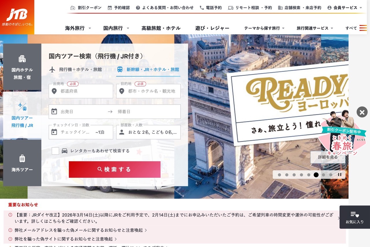
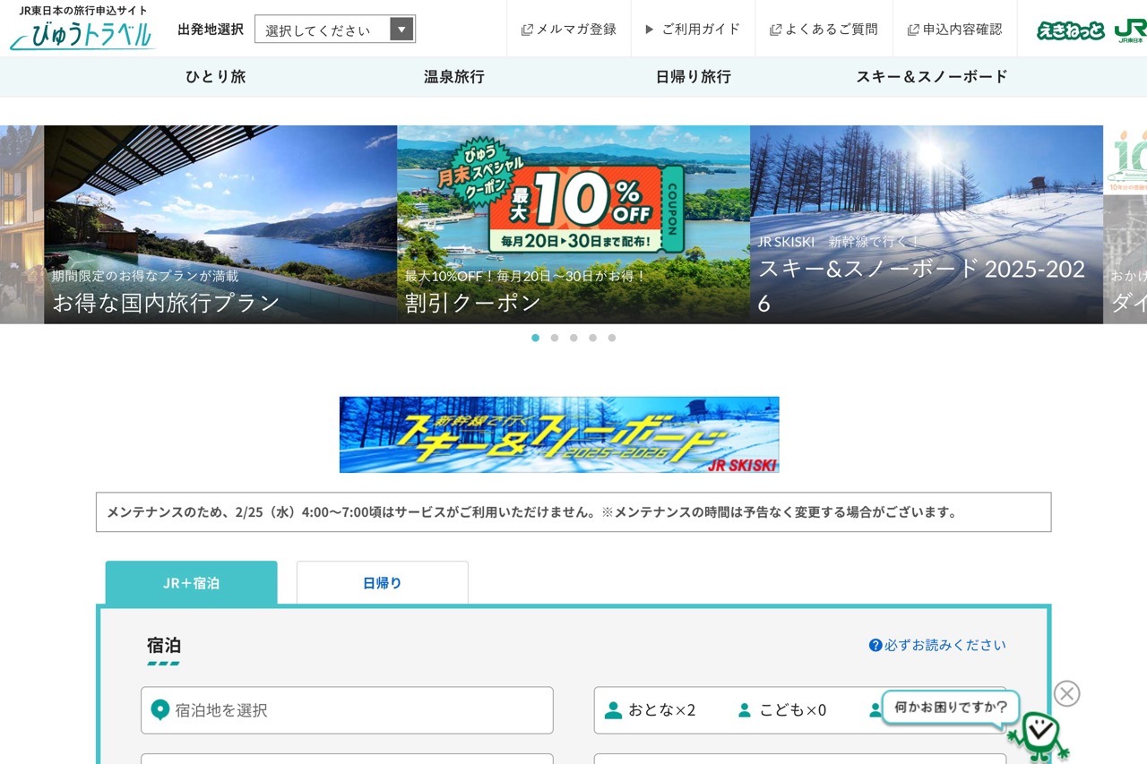
NIKKEI’s website is a high-functioning anxiety attack in financial form. It crams charts, tickers, headlines, and ads into every pixel like it’s billing by the square centimeter. The site is built for speed-reading analysts, not casual browsers—everything’s clickable, nothing breathes. Navigation is sharp but buried under a wall of dropdowns. Still, it delivers: structured, responsive, and unapologetically dense. This isn’t UX for the faint of heart—it’s for users who drink macroeconomic forecasts with their coffee.


