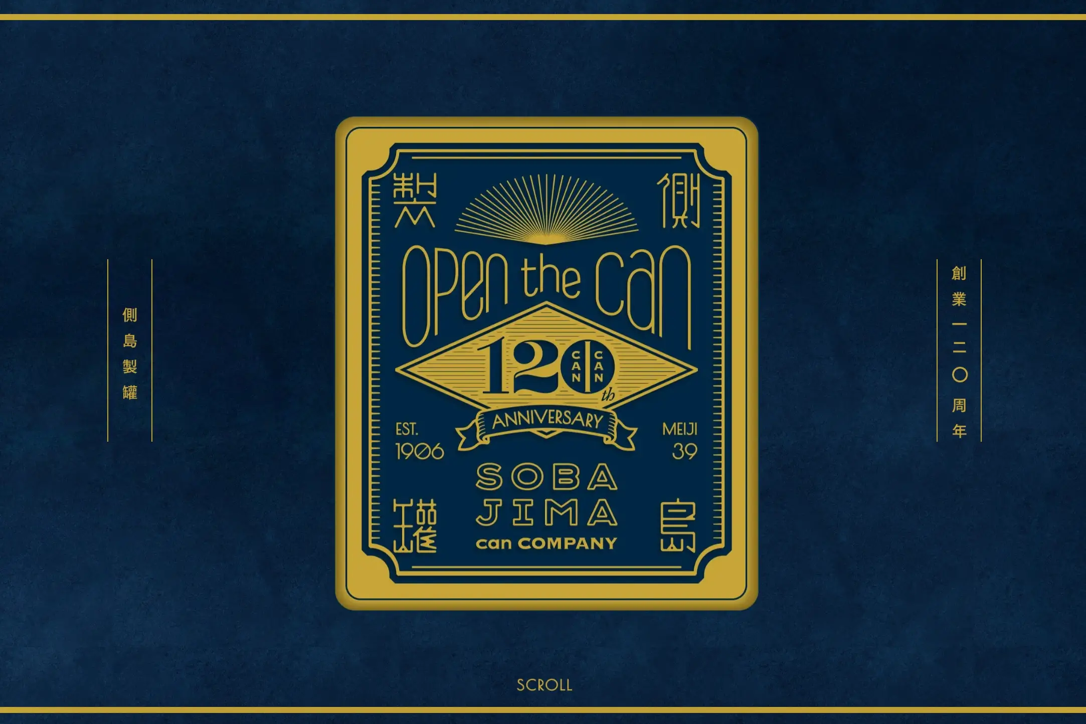
The website tries to run before it can walk with its overzealous use of animations. While they aim to impress, they end up creating a maze that users have to navigate, turning what should be a straightforward experience into a bit of an obstacle course. Flashy doesn’t always mean functional, and this is a classic case of style stepping over substance.
Then there’s the issue with shading effects—sure, they look slick, but when they compromise readability, they miss the mark. The low contrast between text and background isn’t just a minor nuisance; it’s a barrier to accessibility, making the content a chore to decipher rather than a delight to digest.
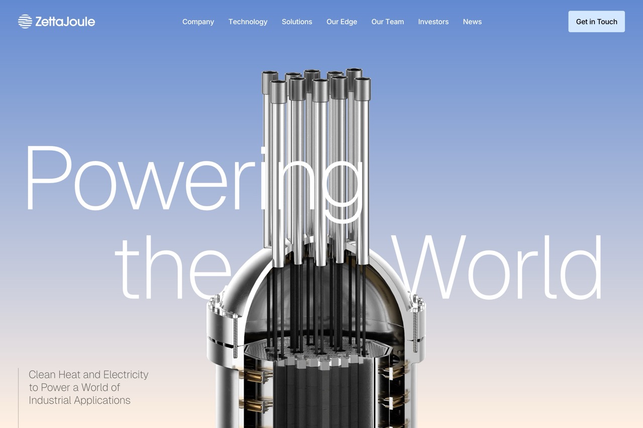
However, the hero image does strike a chord. It’s a breath of fresh air amidst the chaos, offering a glimpse of what could have been if the site had balanced innovation with usability. This element shows that there’s a kernel of good intent here—it’s just buried under a few too many layers of ‘cutting-edge’ design choices.