2025 is shaping up to be another exciting year in Japanese web design. With a mix of cutting-edge tech and cultural nuance, designers here are finding new ways to craft digital experiences that are both deeply personal and uniquely local. In this post, we’ve pulled together some of the biggest trends we’re seeing across Japanese web projects this year, based on insights from some of the country’s most thoughtful and forward-looking blogs.
Table of Contents
1. Immersive 3D Experiences Tailored for Precision
2. AI-Driven Personalization with a Human Touch
3. Neo-Retro Design: Y2K Meets Showa Nostalgia
4. Experimental Navigation: Scroll, Tap, Discover
5. Microinteractions as UX Etiquette
6. Adaptive Dark Mode: Balanced and Contextual
7. Bento Box Layouts: Orderly, Modular, Efficient
8. Sustainable and Minimalistic by Design
9. Accessible Design: From Obligation to Expectation
10. Short-Form Video and Animation for Impact
11. Interactive Cursors and Playful Details
12. Typography as Identity
13. Glassmorphism and Neumorphism with Restraint
14. Horizontal Scrolling as Storytelling
15. Emojis and Informality in Microcopy
Final Thoughts
1. Immersive 3D Experiences Tailored for Precision
3D design has been gaining traction everywhere, but in Japan, it’s not just about flash—it’s about detail. We’re seeing e-commerce sites, especially in sectors like fashion and electronics, use interactive 3D product views to mimic real-world browsing. Thanks to tools like WebGL and Three.js, these experiences feel smooth and deliberate—fitting right into Japan’s high expectations around product presentation.
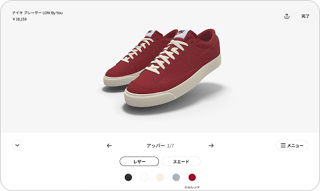
Nike Japan has a site that allows users to modify their shoes before placing an order. It’s clean, detailed, and shows the potential of 3D in consumer product presentation (click “カスタマイズ” below the shoe sizes at right to let the client script load the builder.)
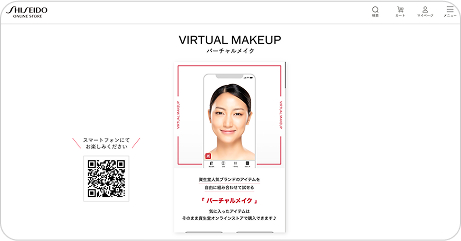
Shiseido “バーチャルメイク” opens a live-camera try-on that tracks your face in real time; swipe through lip, eye, and cheek colours and watch the 3-D AR overlay move naturally as you turn your head.
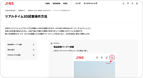
JINS VIRTUAL FIT drops you into a webcam-based fitting room where the frames lock onto your face and stay aligned while you tilt, nod, or look side-to-side—letting shoppers inspect every angle before they buy.
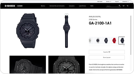
G-SHOCK GA-2100 features a “360° Rotating image” tool—drag to spin the watch, zoom in on the bezel and case-back, and appreciate the detailing up close.
2. AI-Driven Personalization with a Human Touch
AI is powering more intuitive site experiences, but what stands out in Japan is how it’s being used to enhance hospitality. Whether it’s switching themes for night-time browsing or surfacing product recommendations based on subtle behavioral cues, Japanese sites are using AI to reflect omotenashi—the spirit of thoughtful service.
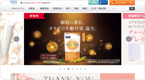
The cosmetics brand FANCL adapts content and tone depending on whether you’re logged in, browsing from mobile, or exploring from a skincare vs. supplement funnel.
3. Neo-Retro Design: Y2K Meets Showa Nostalgia
There’s a wave of nostalgia moving through Japanese design right now, with Y2K-inspired visuals, bold gradients, and even hints of Showa-era charm. Sites targeting Gen Z and millennial audiences are reworking retro design language with clean grids and contemporary UX—melding old-school character with modern flow.
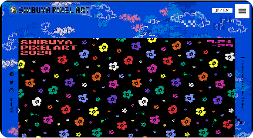
Shibuya Pixel Art leans into early‑internet vibes with pixel fonts and 8‑bit icons, but keeps the layout airy and modern with a tidy grid and soft gradients.
4. Experimental Navigation: Scroll, Tap, Discover
Menu bars are being replaced with exploratory navigation. Scroll-triggered reveals, lateral movement, and immersive layouts are making sites feel more like experiences. It’s a shift we’re seeing across creative portfolios, brand sites, and campaign landing pages.
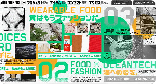
Urban Research Expo breaks the frame with hybrid horizontal scrolling, pinned menus, and animated surprise reveals..
5. Microinteractions as UX Etiquette
Little design details carry a lot of weight in Japan, and microinteractions are now a key part of showing users they’re being looked after. Hover effects, subtle transitions, and input feedback aren’t just functional—they’re part of how trust is communicated online.
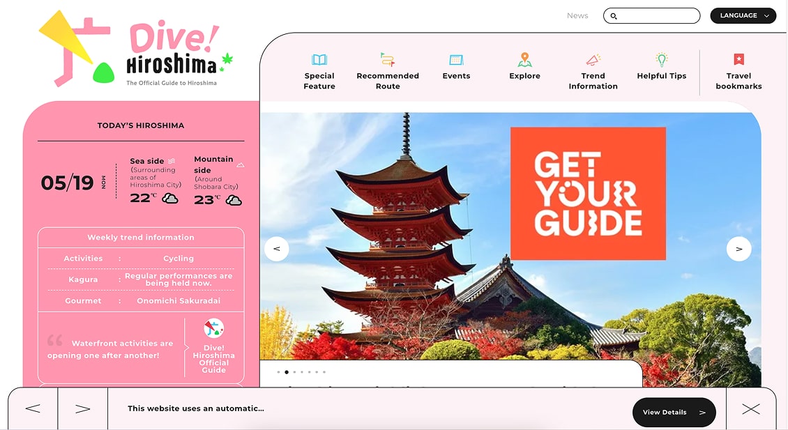
Many city tourism websites like Visit Hiroshima use microinteractions to encourage exploration without overwhelming the visitor.
6. Adaptive Dark Mode: Balanced and Contextual
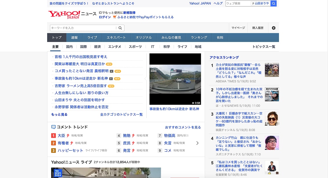
Dark mode is now expected, but Japanese news and reading apps (e.g., Yahoo! ニュースやSmartNews) respect the device’s system dark‑mode setting—something many users schedule to flip automatically from sunset to sunrise. The shift happens seamlessly, giving a calmer, eye‑friendly palette during night‑time reading
Yahoo News subtly transitions to dark mode in mobile reading view during evening hours.
7. Bento Box Layouts: Orderly, Modular, Efficient
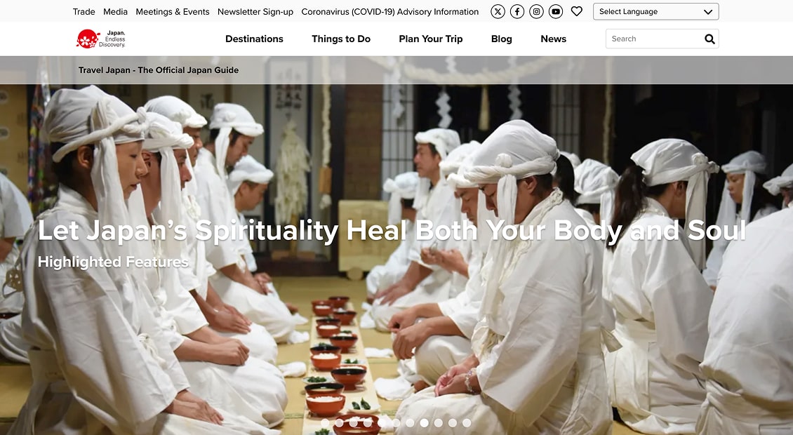
The bento box approach—modular, balanced, and mobile-friendly—is being used to structure content in a way that’s easy to scan. This design logic works especially well for service sites and marketplaces, where clarity and quick navigation are key.
The homepage of Japan Travels is a strong example of bento-box modularity applied to global tourism content.
8. Sustainable and Minimalistic by Design
A growing number of Japanese designers are taking sustainability seriously, optimizing load speeds with compressed media, streamlining visual clutter, and leaning into simple color palettes. The result? Lighter, faster, and calmer interfaces that feel as good as they look.
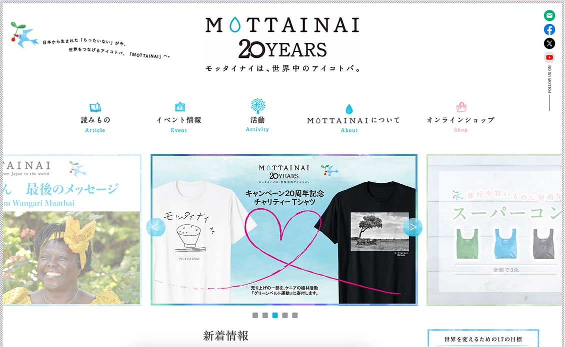
Mottainai not only promotes sustainability through messaging but reflects it in their stripped-down, low-energy design.
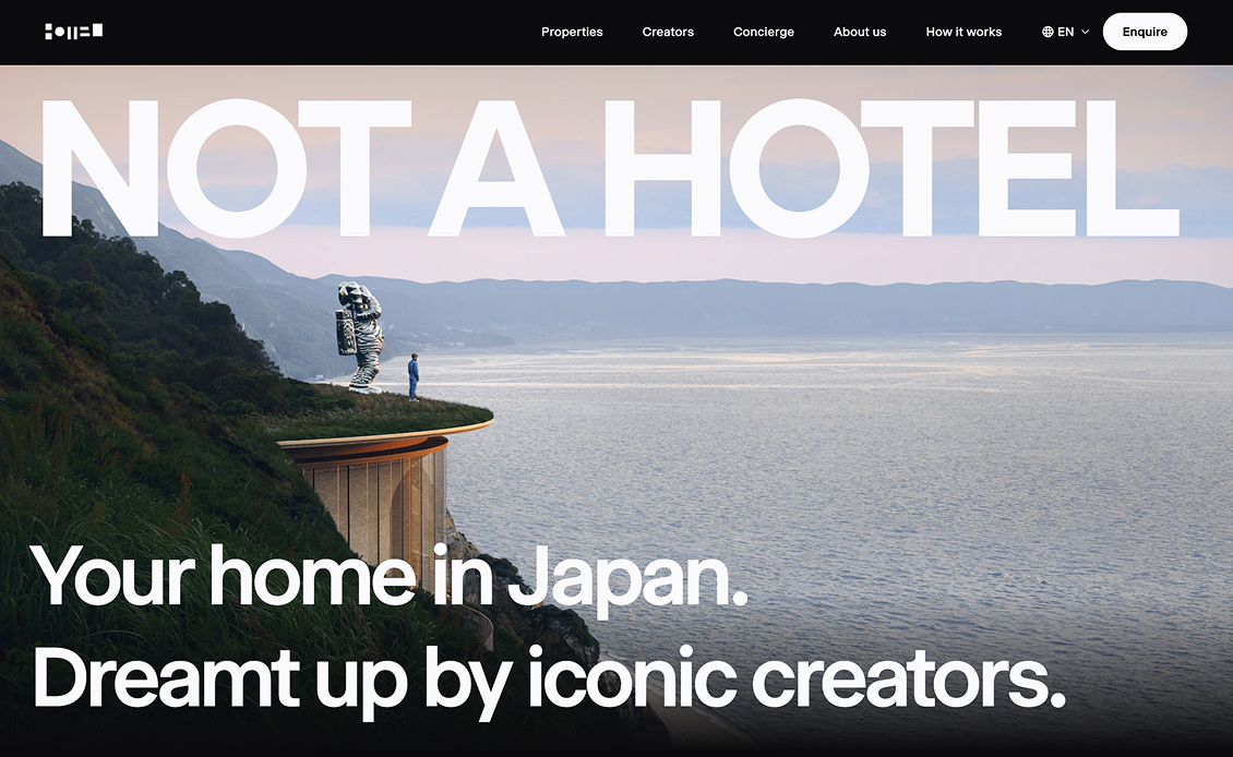
Not a Hotel (日本語版) keeps things light and luxurious—full‑bleed photography, plenty of whitespace, and a muted two‑color palette give the pages an airy feel, while subtle fade‑in animations guide the scroll without adding bulk. The pared‑back assets load quickly, perfectly illustrating Japan’s move toward sustainable, minimalist web design.
9. Accessible Design: From Obligation to Expectation
Accessibility in Japan is shifting from a checklist item to an assumed feature. Responsive type, keyboard-friendly navigation, and screen reader support are being thoughtfully integrated—making sure that every visitor is considered.
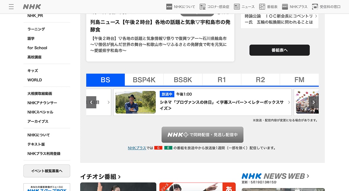
The NHK site supports multiple text sizes, voice navigation, and clear alt-tag usage.
10. Short-Form Video and Animation for Impact
From homepages to product launches, short-form videos are becoming a go-to storytelling tool. You’ll see this especially in fashion, beauty, and architecture, where quick visual narratives help build emotional connection without overwhelming the user.
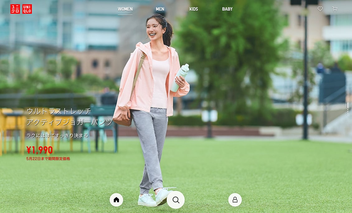
Uniqlo embeds looping video clips directly into product tiles, letting visuals do the talking.
11. Interactive Cursors and Playful Details
Cursors aren’t just pointers anymore—they’re part of the design story. On creative and portfolio sites in particular, animated cursors and custom hover states are adding a playful, polished layer to user interaction.
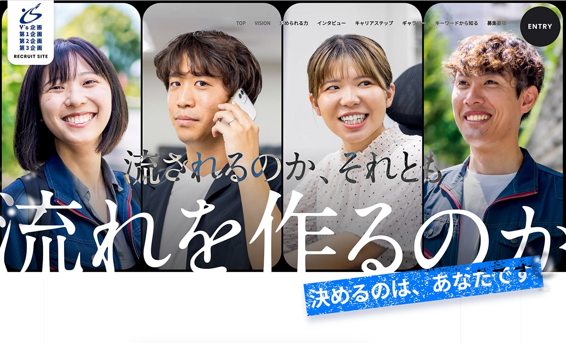
Y’s Kikaku replaces the arrow with a subtle cross‑hair that thickens into a dark ring when you hover menus or CTAs—clean “target” feedback that makes interactive areas pop.
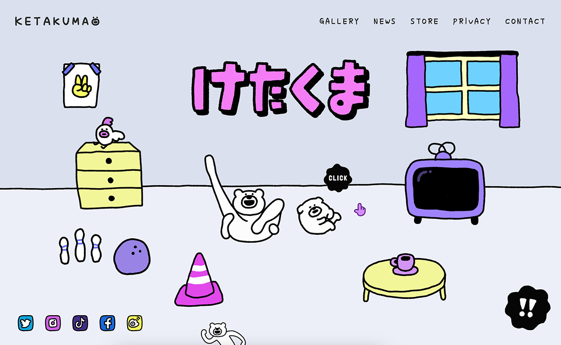
Keta Kuma swaps the standard arrow for a tiny dancing bear paw; hover any mascot or button and the paw wiggles, adding playful personality to every click.
12. Typography as Identity
Fonts are doing more than just conveying text—they’re carrying brand tone. Whether it’s brushstroke type on a sake brand’s site or tight sans-serifs on a fintech platform, typography in Japan is deeply intentional.
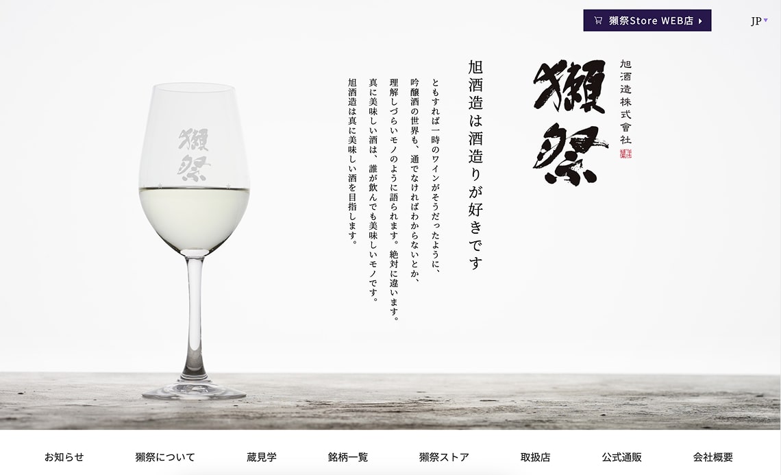
Asahi Shuzo Dassai (旭酒造) opens with bold, inky 獺祭 brush‑stroke kanji splashed across each hero banner; all supporting copy sits in a neat, modern sans‑serif, so the calligraphy carries the heritage while the UI stays airy and contemporary.
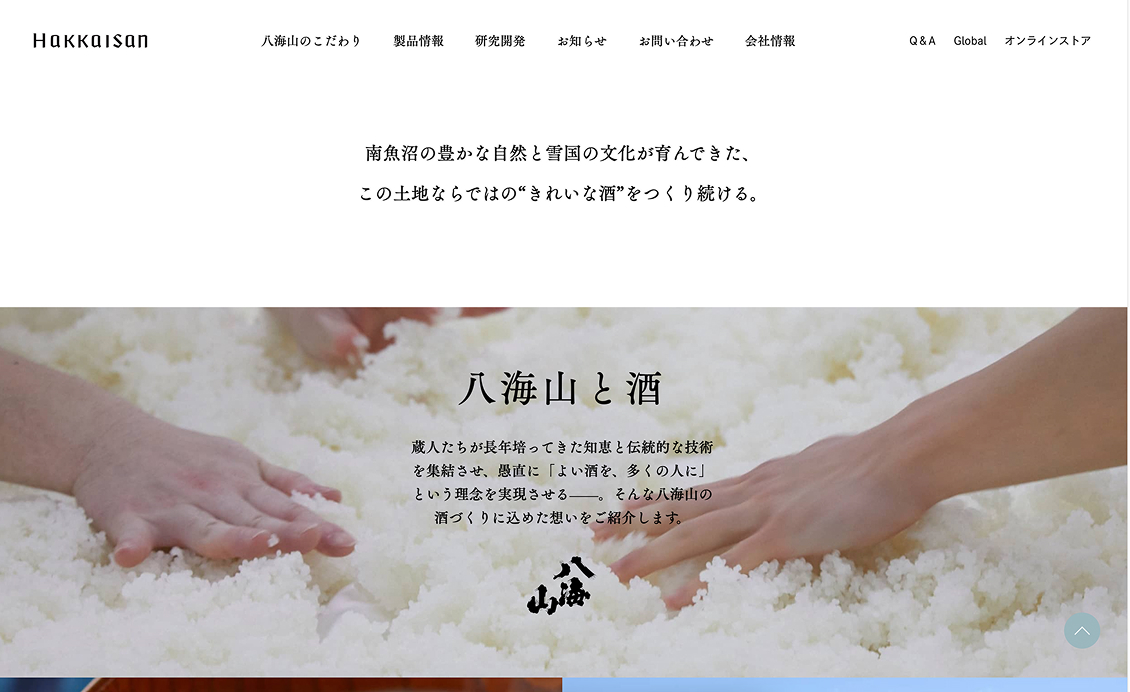
Hakkaisan pairs every bottle shot with thick, hand‑painted 八海山 characters, then keeps navigation and body text in a crisp geometric font—letting the expressive kanji logos pop against an otherwise minimalist layout.
13. Glassmorphism and Neumorphism with Restraint
Both of these visual styles are being used—but sparingly. Designers here are more likely to apply them to buttons, overlays, or interactive modules, keeping the overall tone elegant and uncluttered.
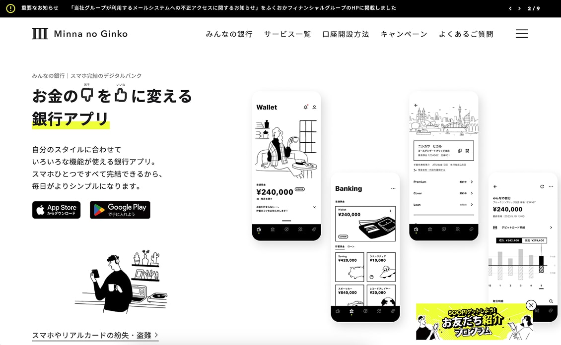
Minna no Ginko, Japan’s mobile‑only bank sprinkles subtle glassmorphic cards over its hero visuals—login prompts, call‑outs, and rate panels float on semi‑transparent “frosted” sheets that blur the background gradient just enough to add depth.
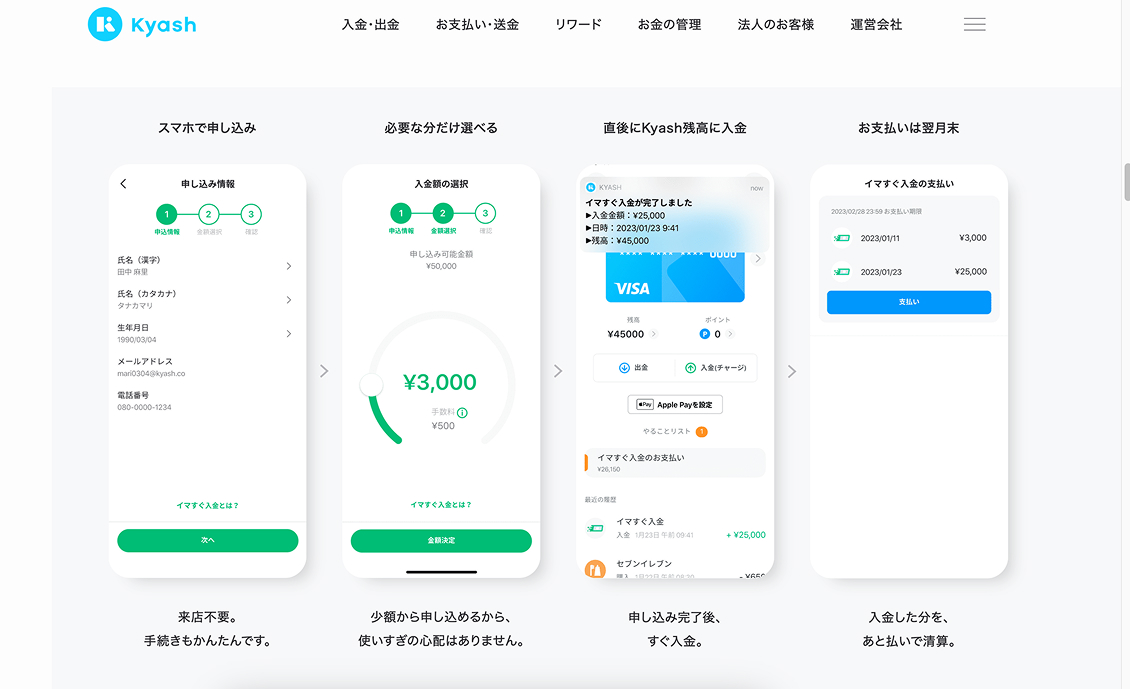
Kyash digital wallet uses soft‑shadow “neumorphic” buttons and translucent status banners around its app mock‑ups, giving the UI a light, pillowy feel without overwhelming the flat design.
14. Horizontal Scrolling as Storytelling
We’re seeing more horizontal layouts—especially in product showcases and artist portfolios—where the scroll direction matches the narrative flow. Done well, it creates a natural sense of progression that feels curated and immersive.
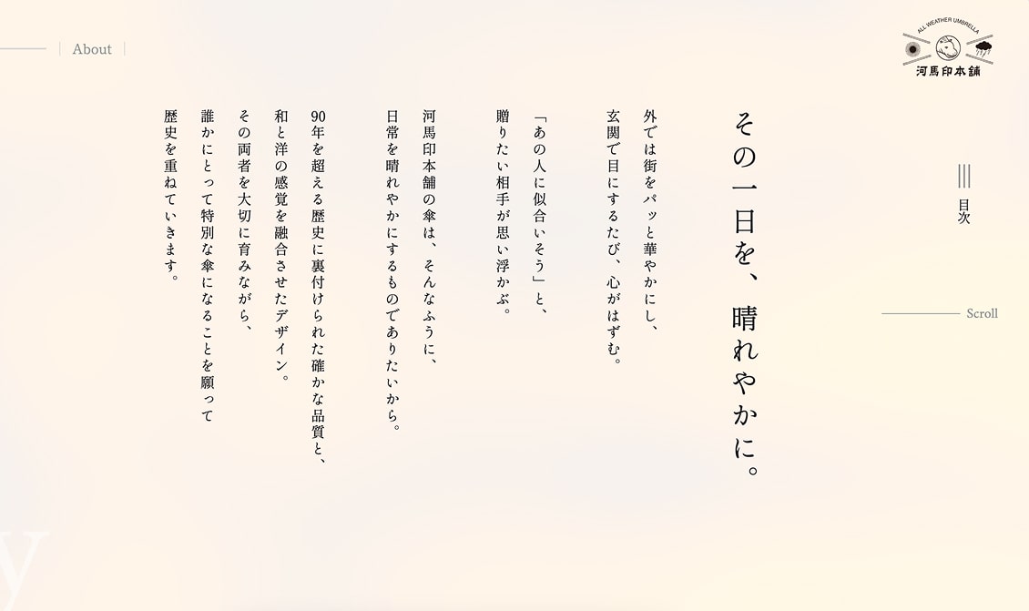
Kaba‑jirushi umbrella brand mixes gorgeous photography with side‑swipe storytelling—scrolling shifts each product “chapter” horizontally like turning the pages of a panoramic catalogue.
15. Emojis and Informality in Microcopy
Brands targeting younger users are loosening up their tone, using casual language, emoji, and a bit of personality in their microcopy. It’s a subtle way of saying “we see you” without trying too hard.
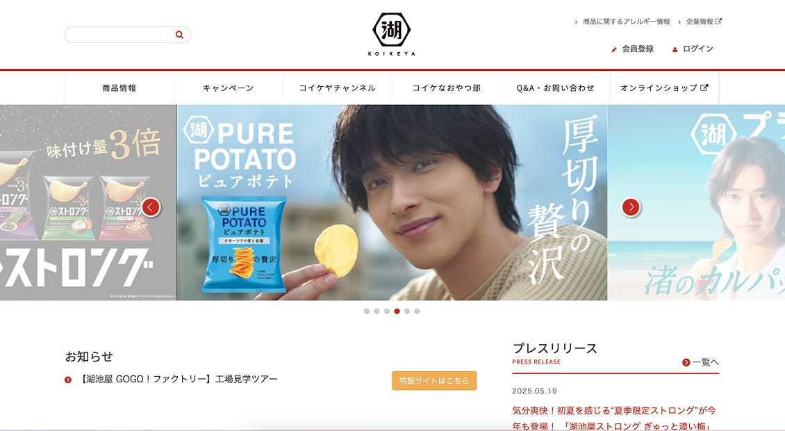
Japanese snack brand Koikeya peppers its site with friendly emoji and chat-like interactions for a light, welcoming feel.
Final Thoughts
Web design in Japan this year is all about thoughtful innovation. From 3D visuals and AI-driven tweaks to retro vibes and sustainable builds, the trends here are as much about how things feel as how they function. Whether you’re designing for a global brand or a local cafe, these shifts offer useful cues on how to create sites that connect.
For deeper inspiration, check out:
GOHP Blog on 2025 Trends
Brik’s Design Trends
Japan Web Design Gallery
Hitotsunagi’s Web Trends
